WOW!
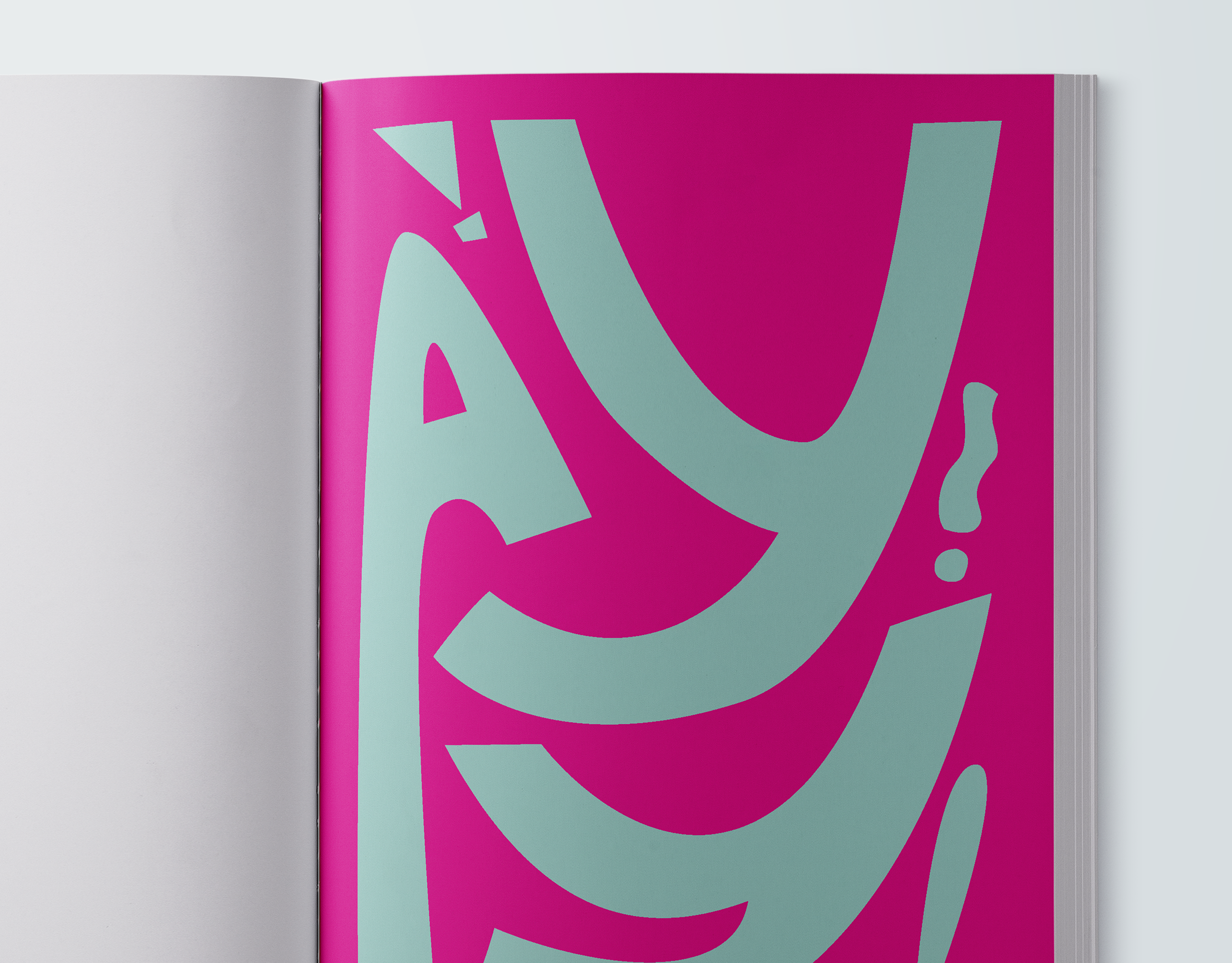
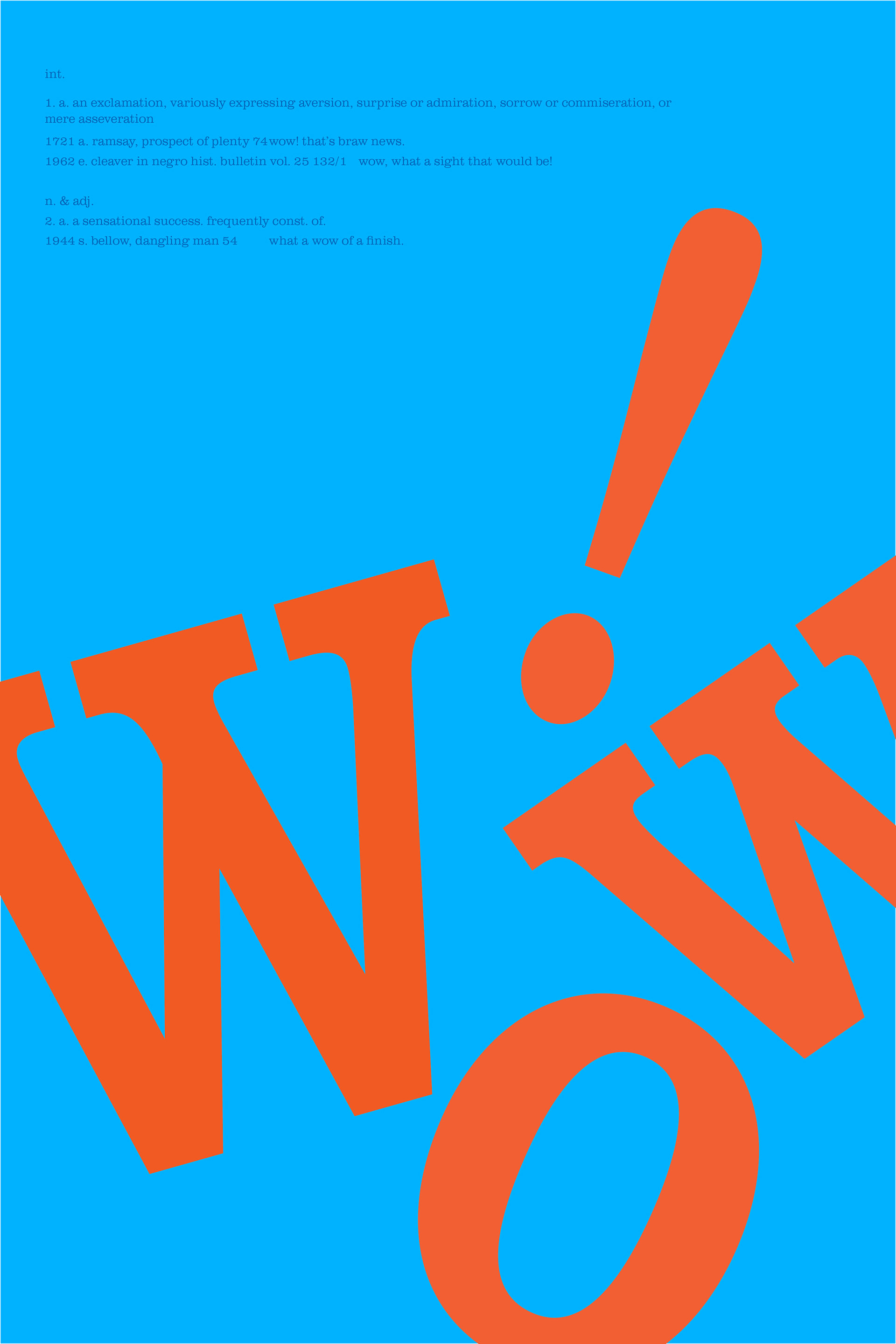
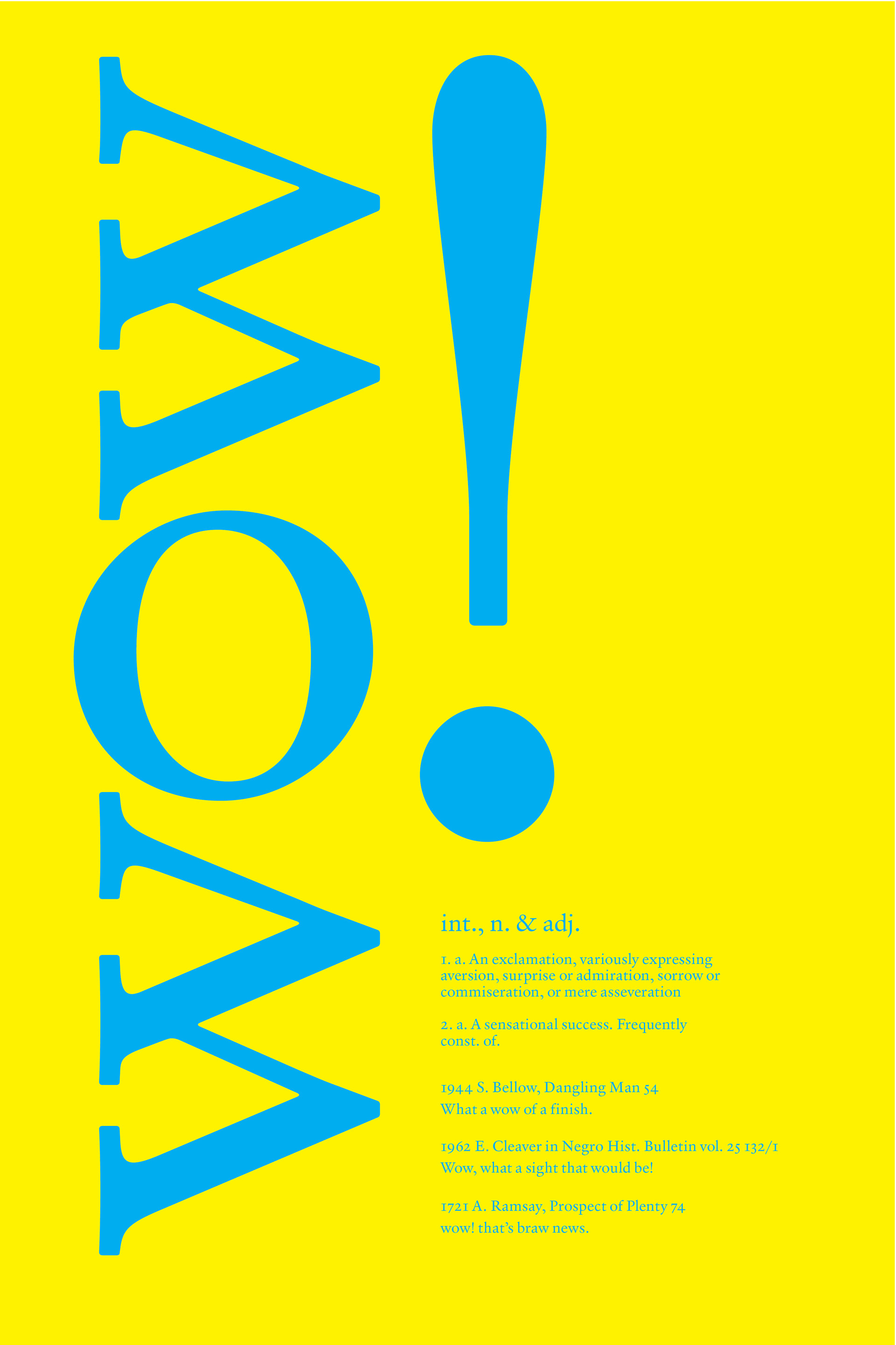
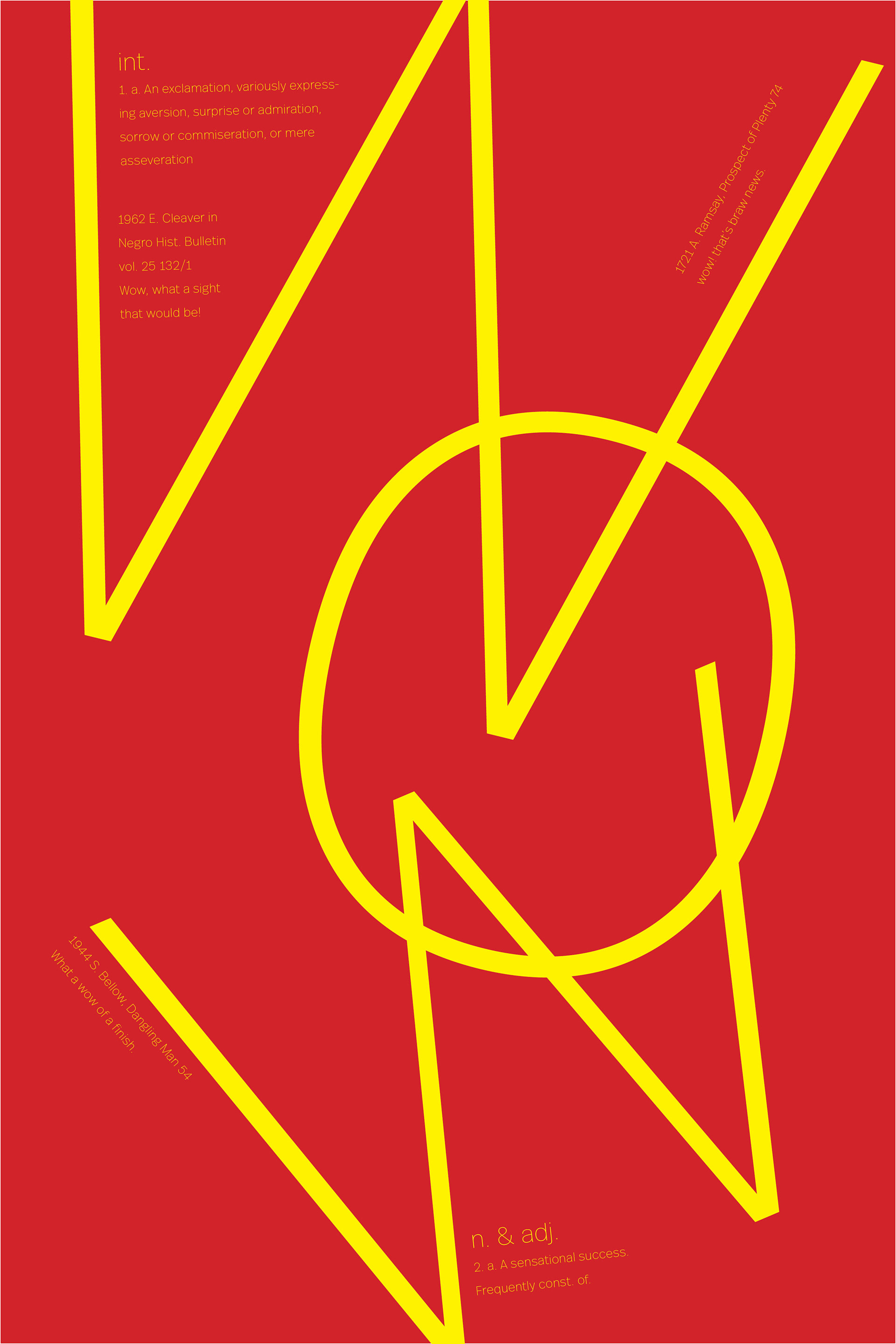
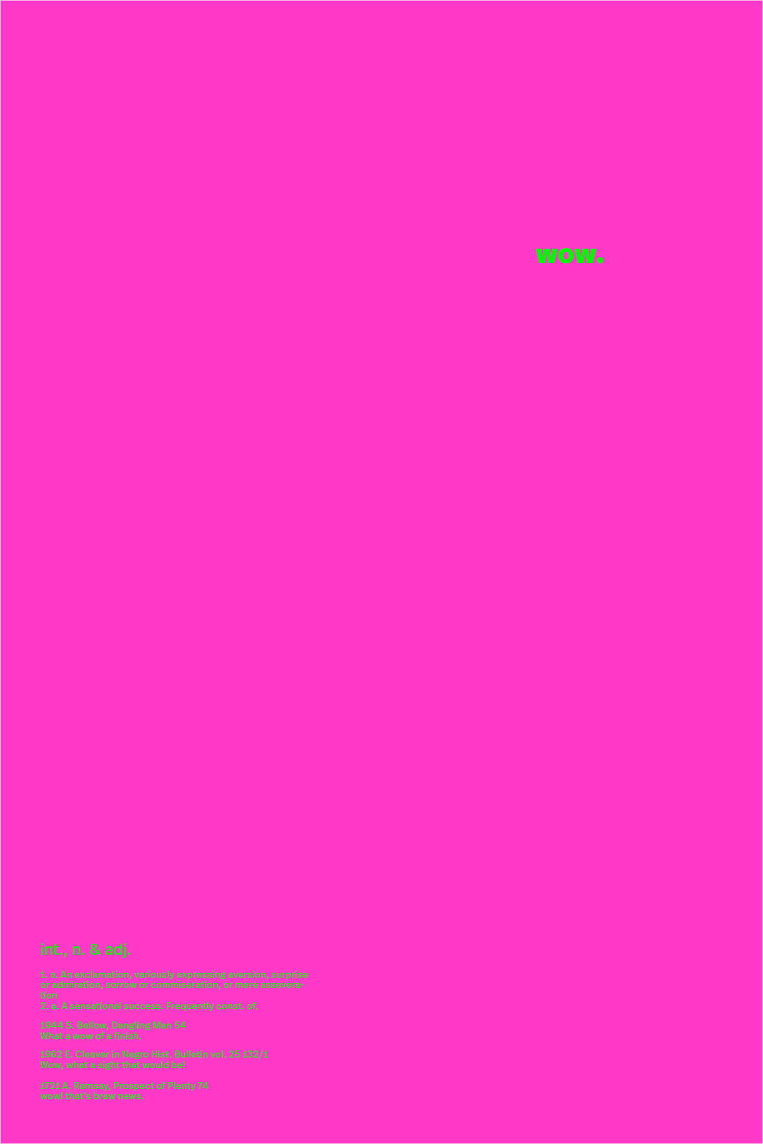
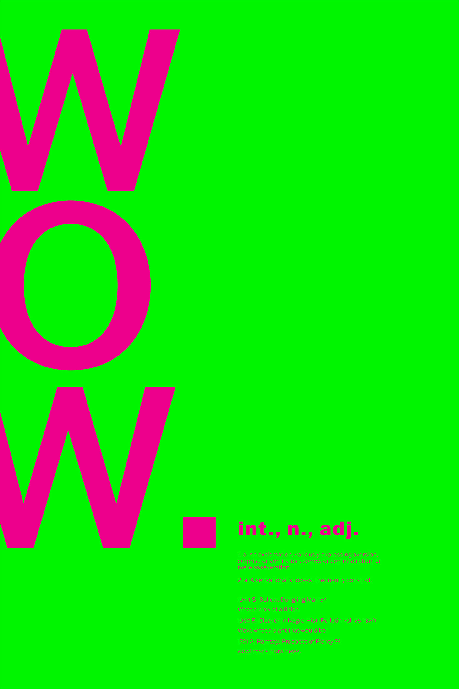
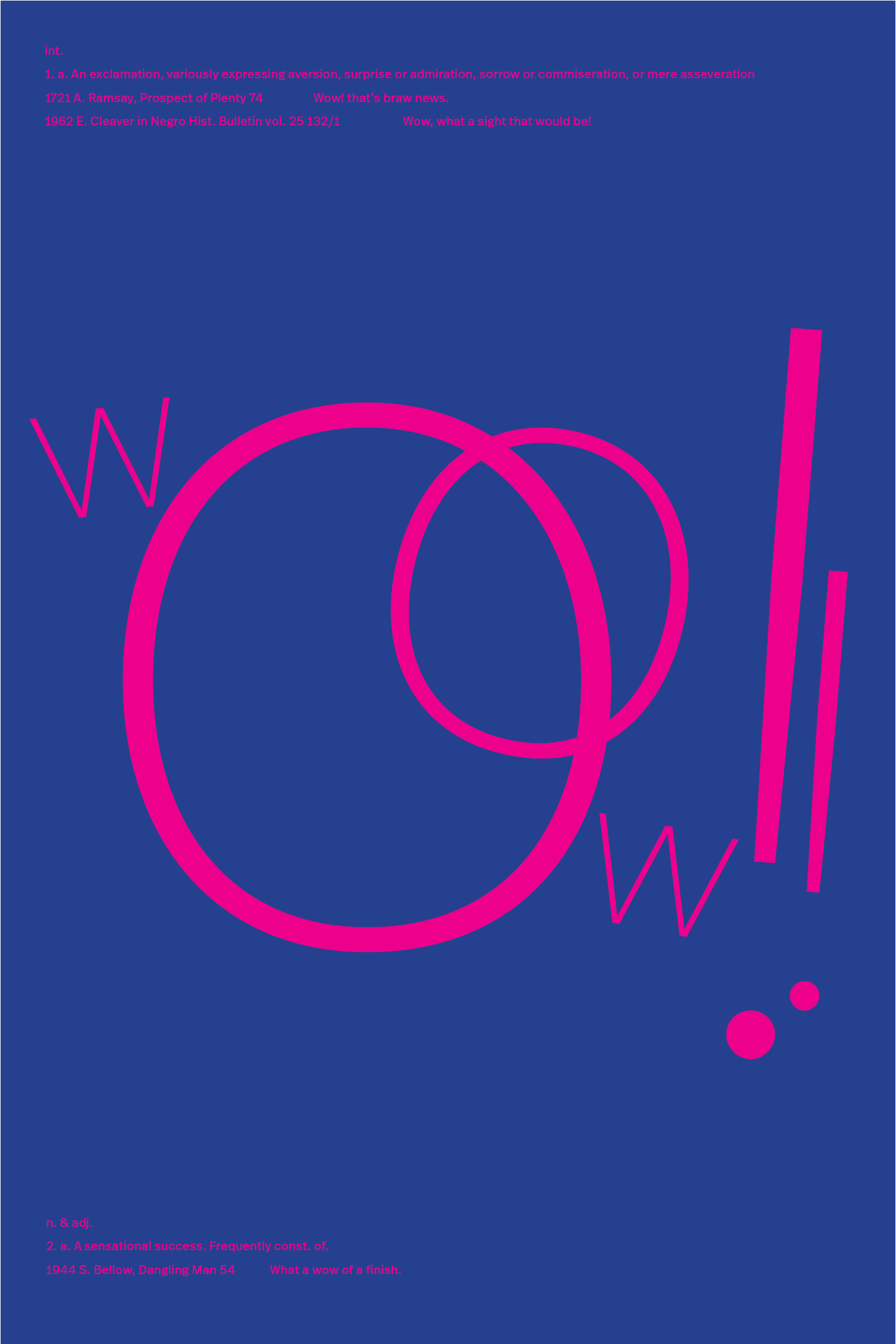
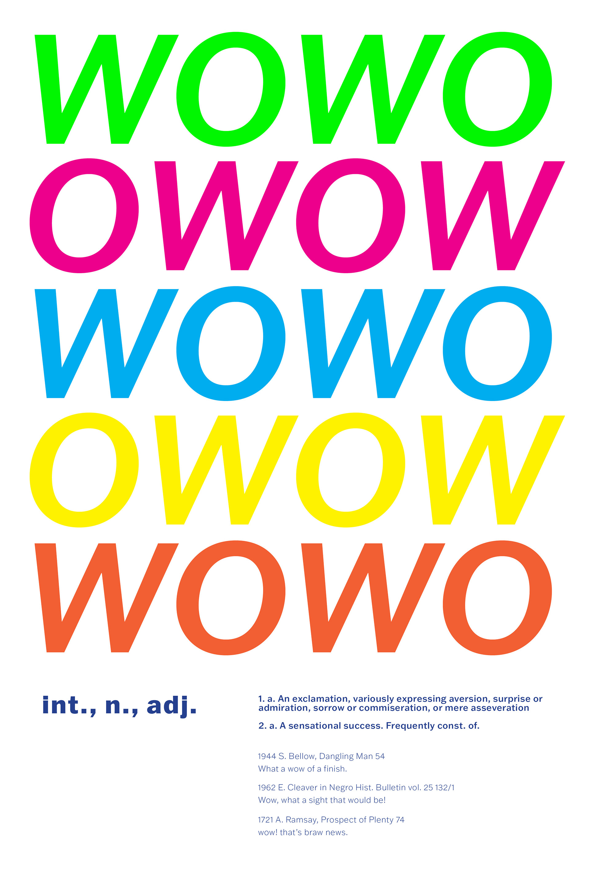
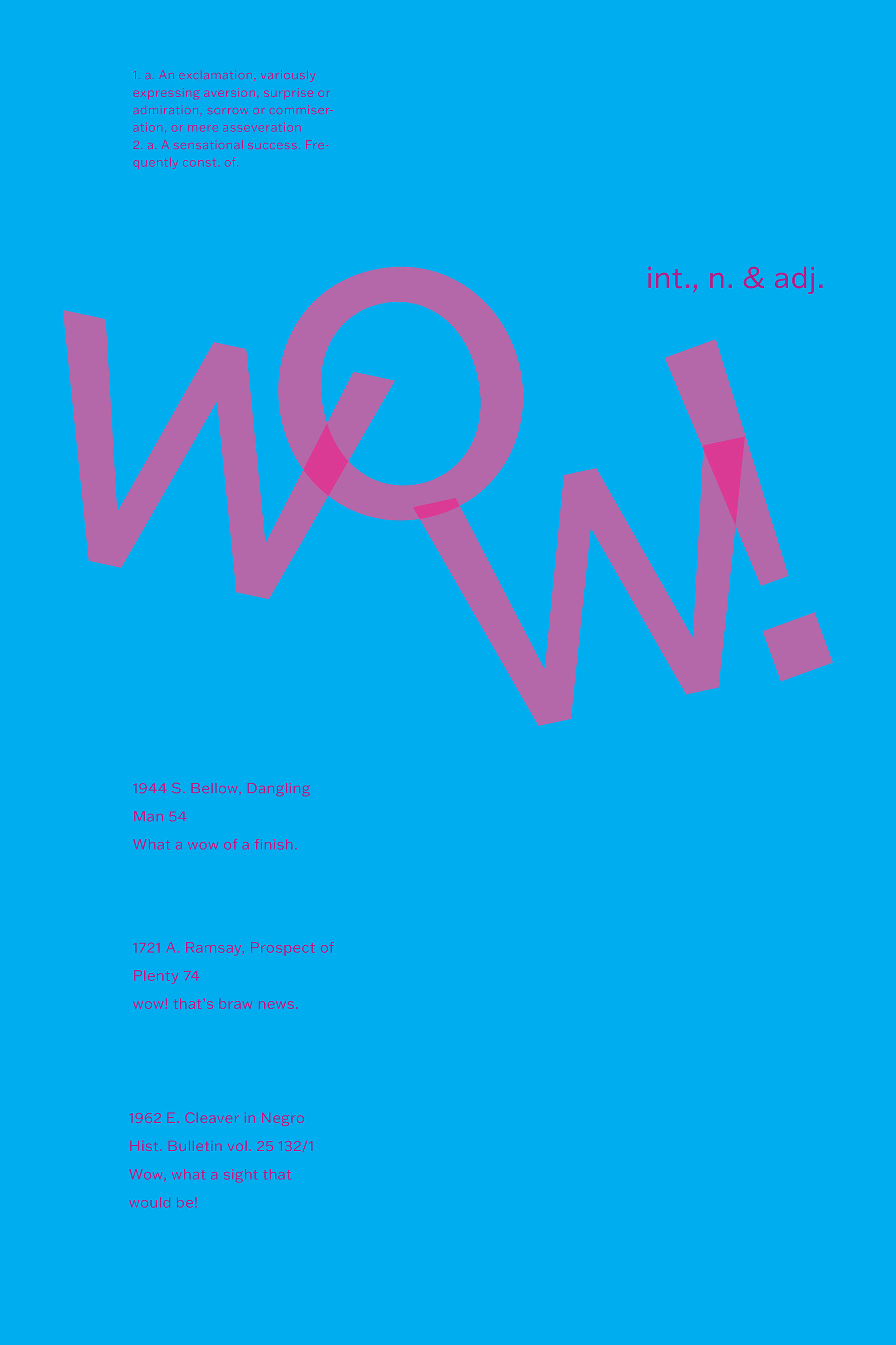
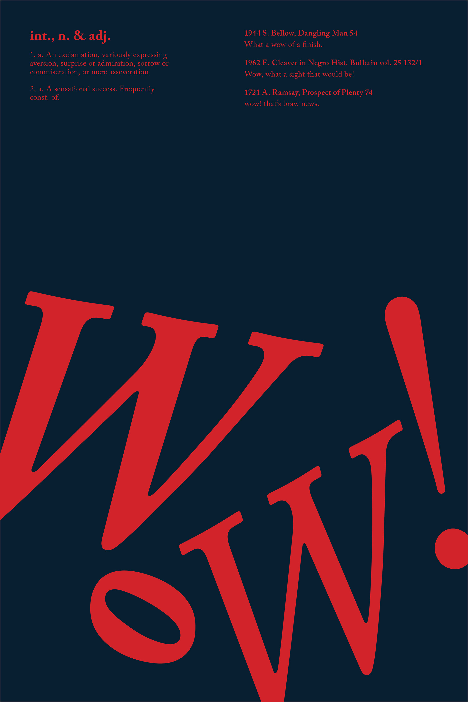
This Typographic Poster Series was an assignment to explore type as image, experimenting with the use of hierarchy, the grid alignment (or mis-alignment) and type placement to express the word and its definition. After choosing the word "wow," I considered a variety of iterations and ways of emphasizing the various emotions of "wow" and its meaning.
Since the word I chose is a commonly used exclamation, I chose to focus more on the expression of the word itself, rather than its supporting definition and legibility. While many posters use large scale shifts to emphasize the word, I experimented with the use of white space and color to bring attention to the subject. I felt the simplicity of 'wow' lent itself to a poster defined by a color palette of pops of bright vibrating colors which bring immediate attention. Each design employs a unique contrast of colors and composition that convey my word and its definition.
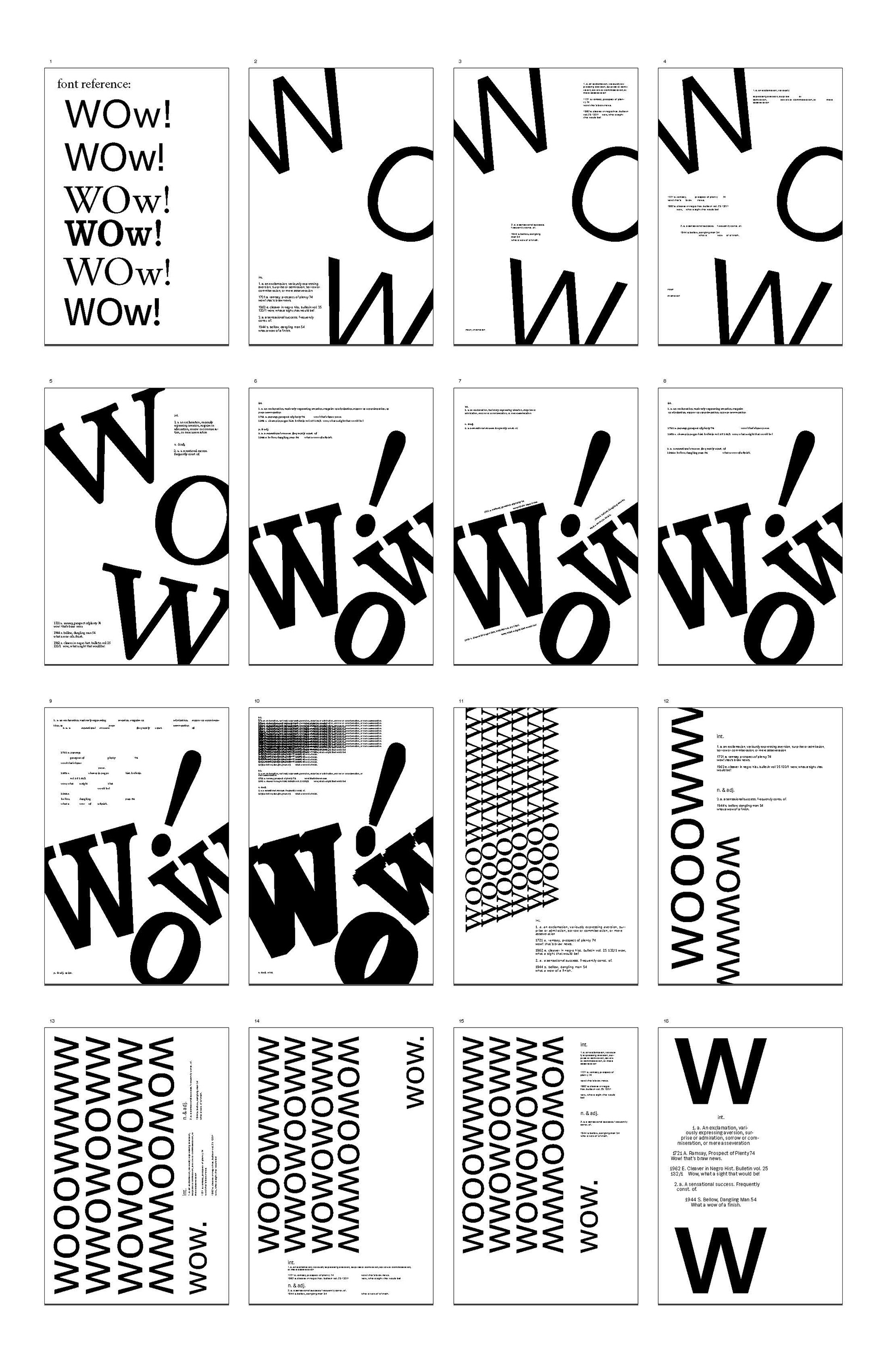
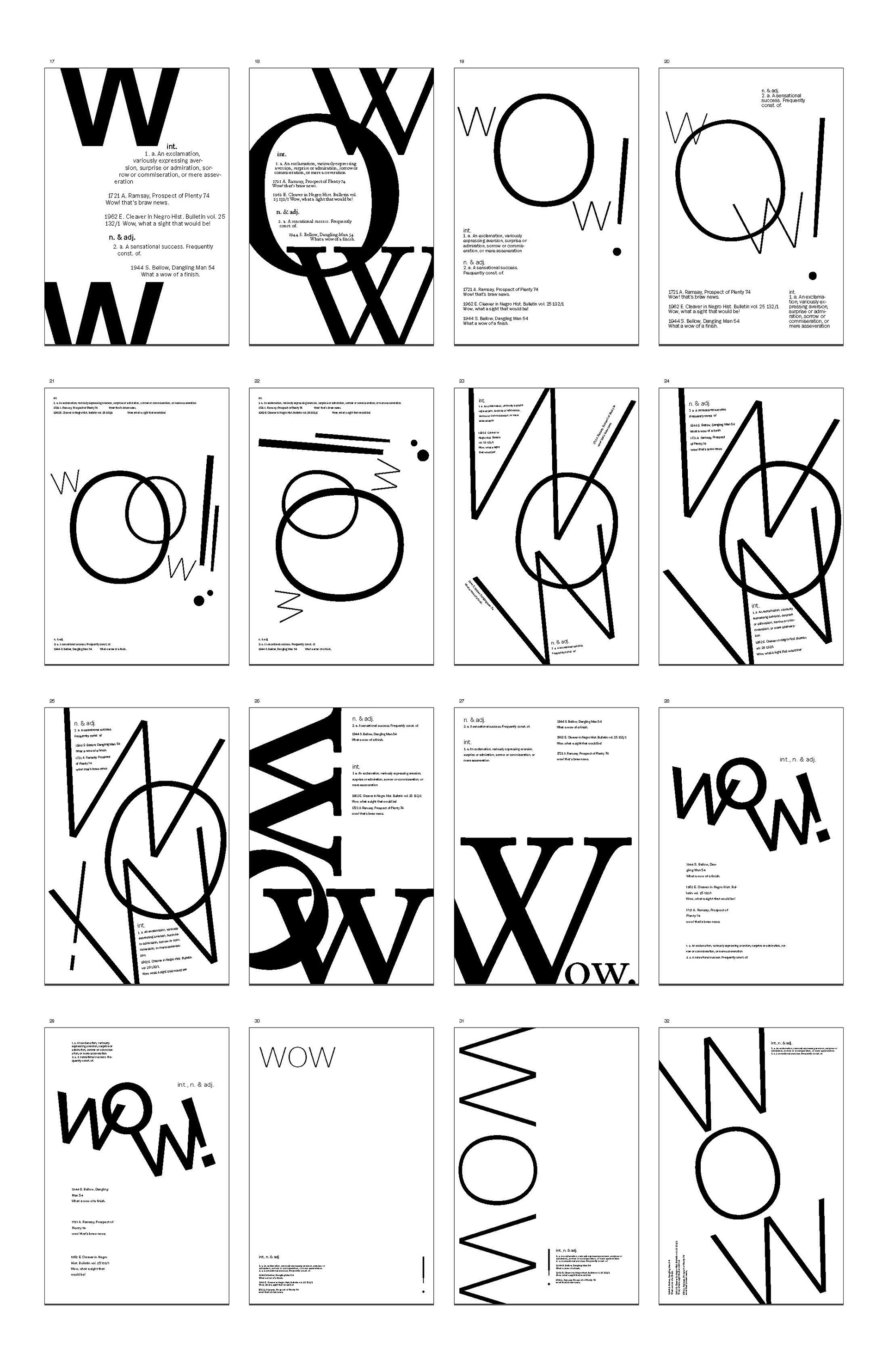
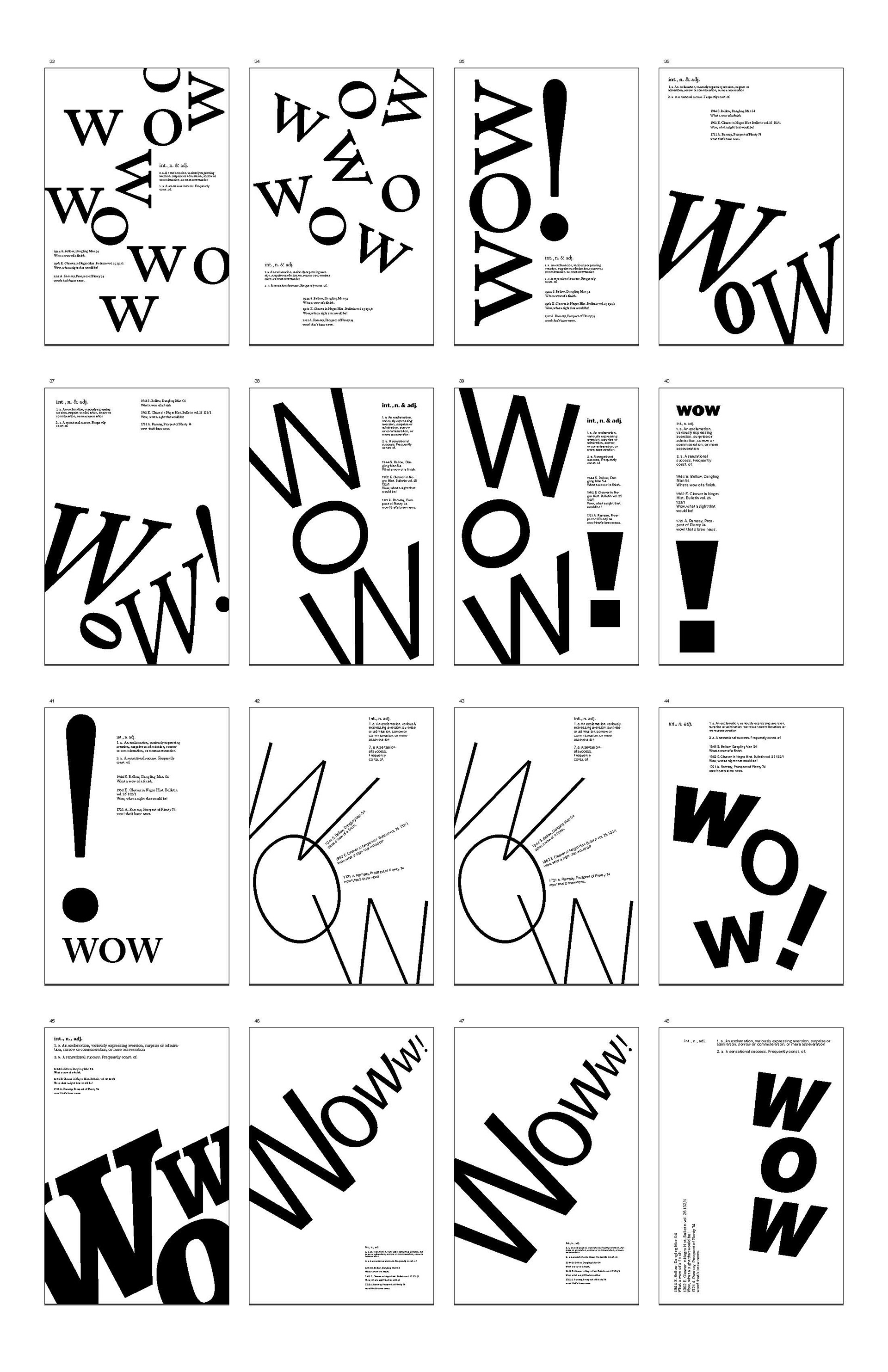
Thumbnail iterations played a key role in deciding my poster compositions and layouts. Through three series of thumbnail sketches, I found ways to creatively emphasize my word through use of white space, alignment, and point size.
