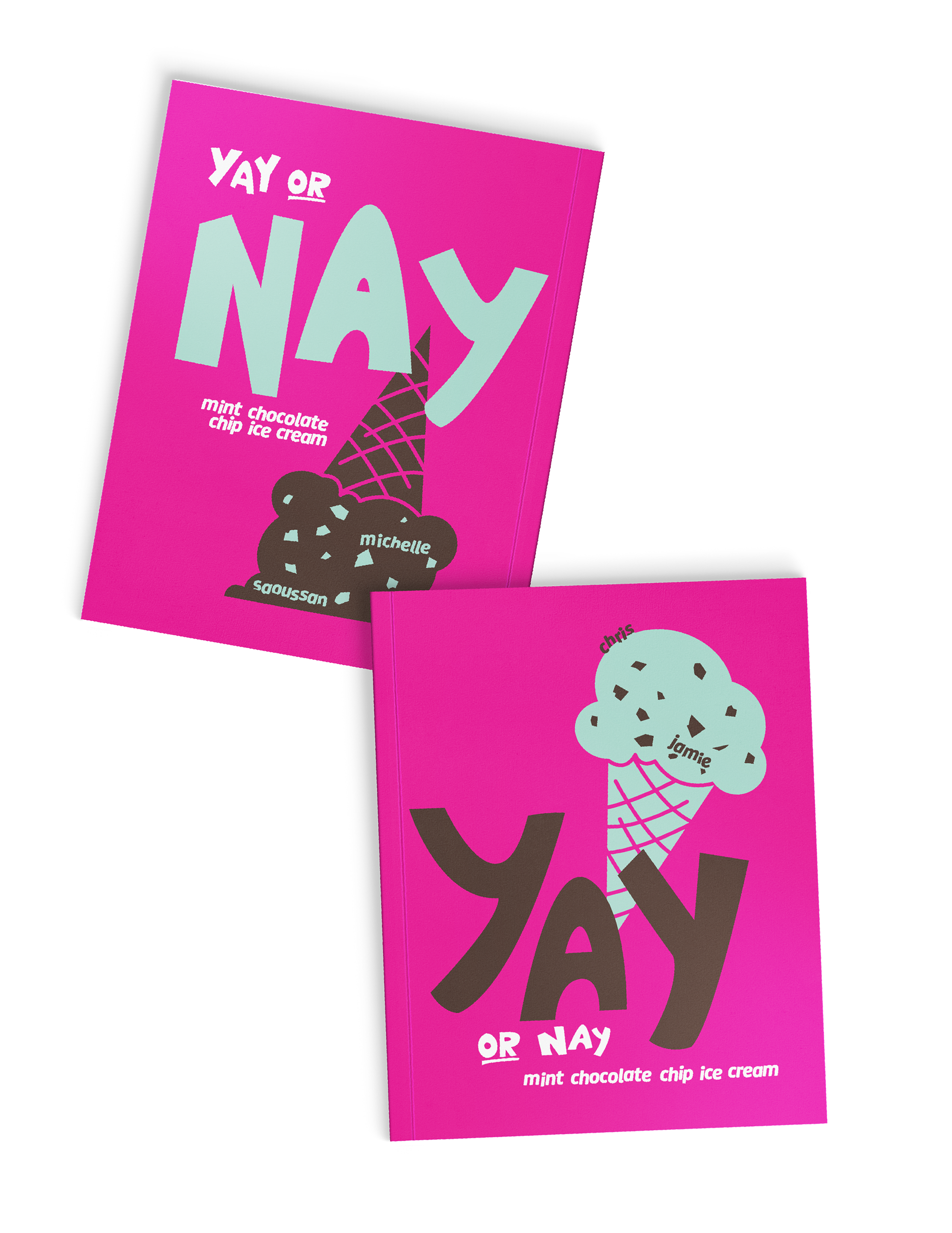
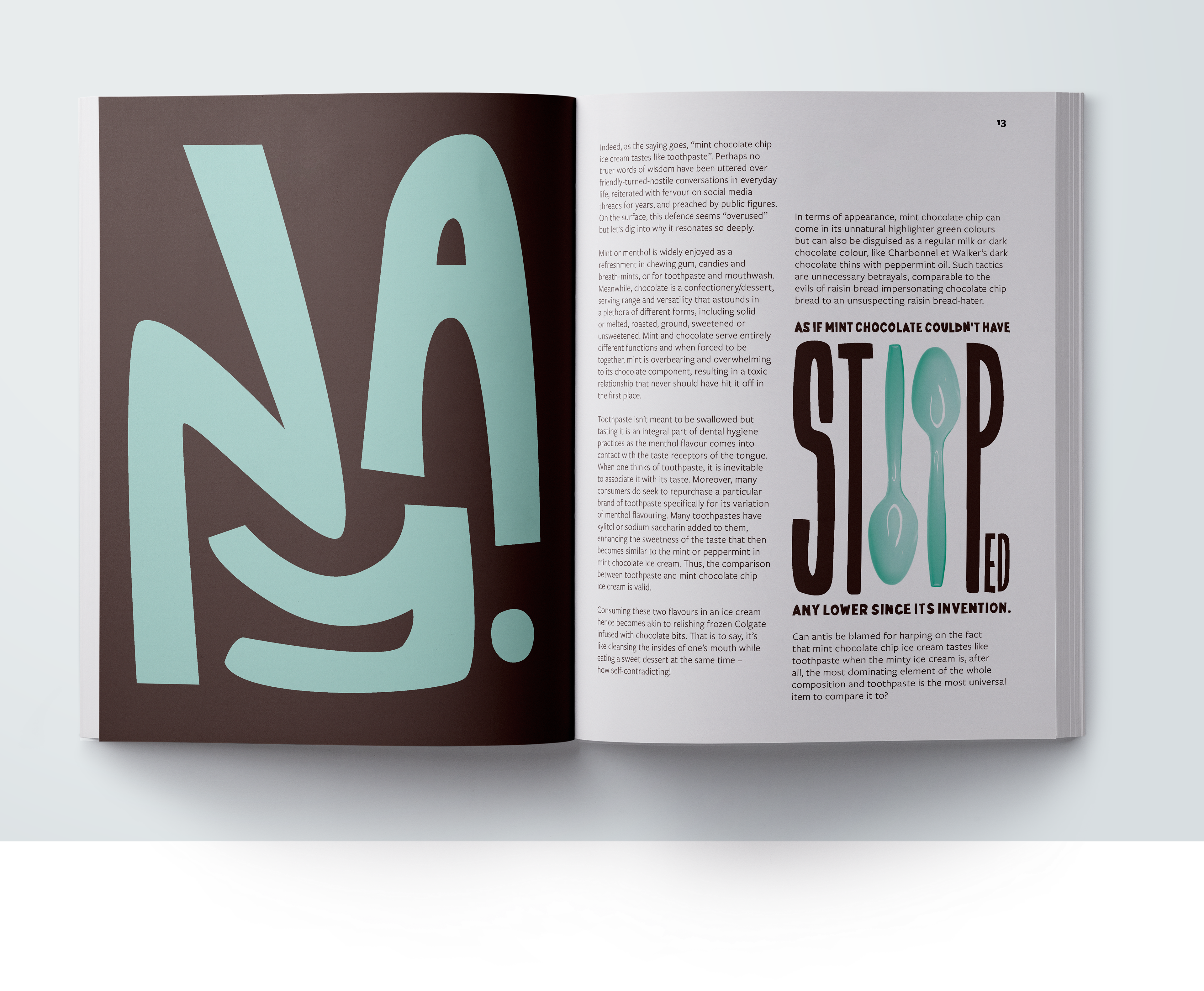
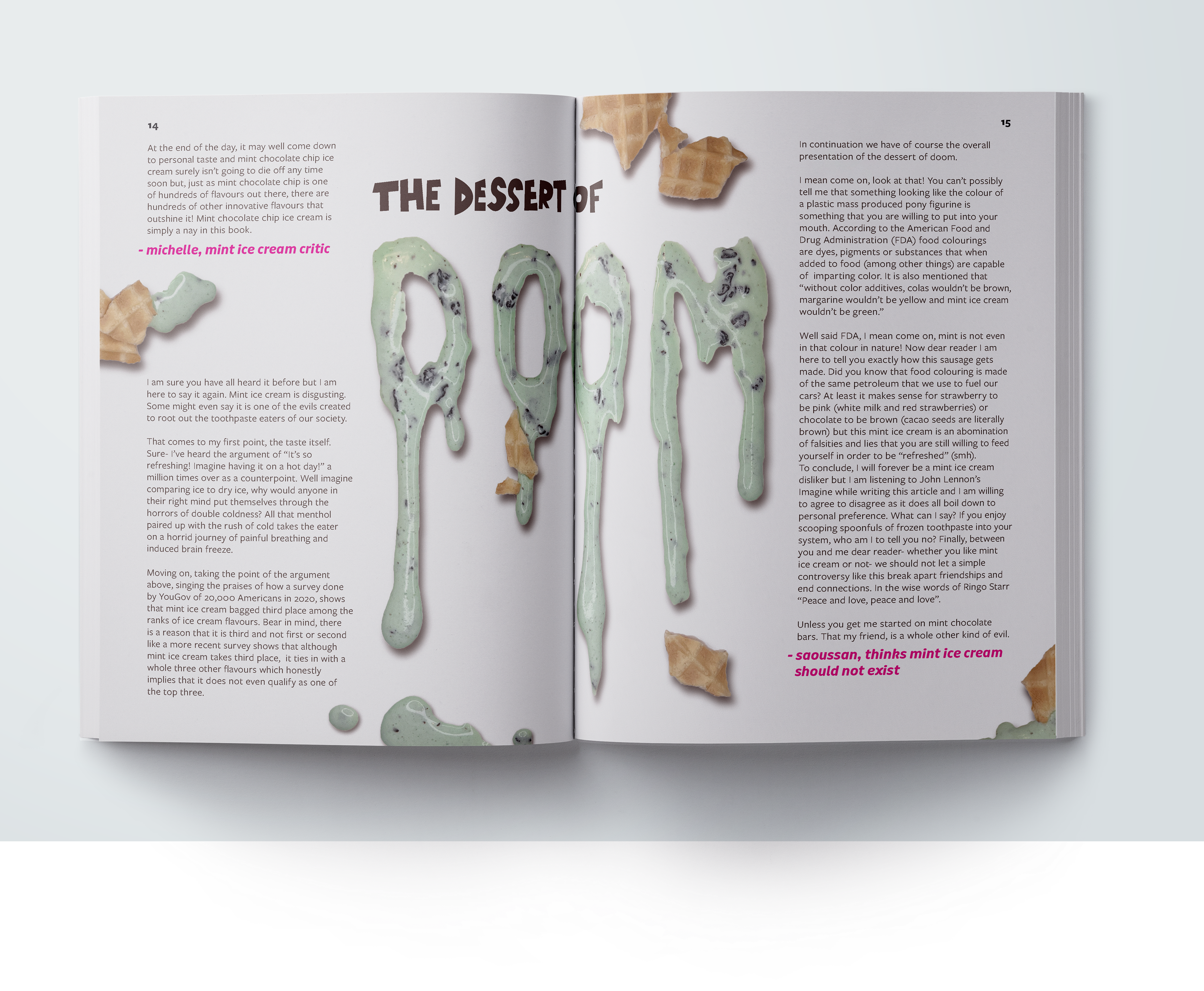
Yay or Nay: Mint Chocolate Chip Ice Cream
Assigned to work from an article of my choosing, I designed a book that explores the themes of mint chocolate chip ice cream and its controversies. Geared towards a broad audience, I made playful design decisions to capture the child-like aesthetic of the love of ice cream.
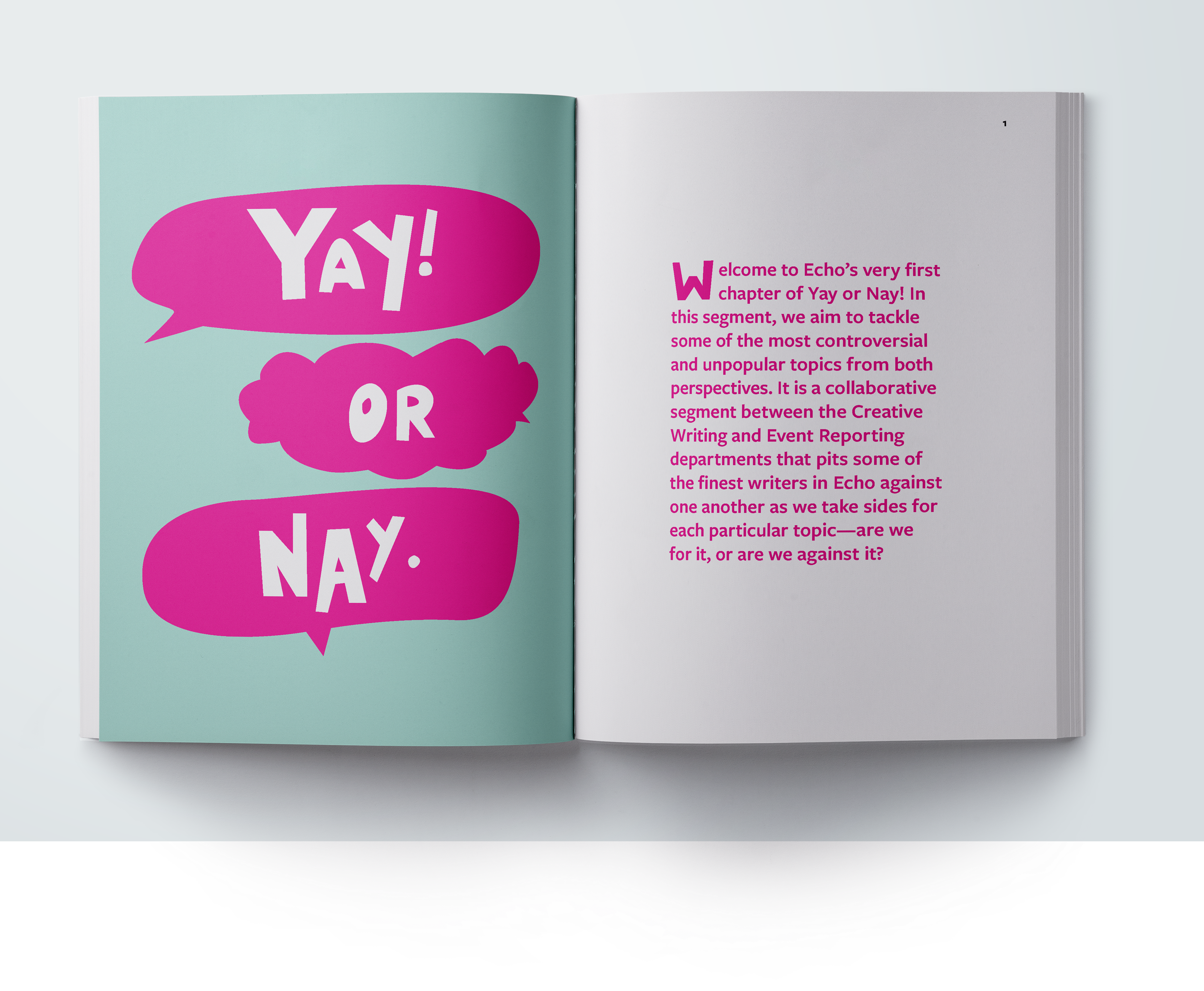
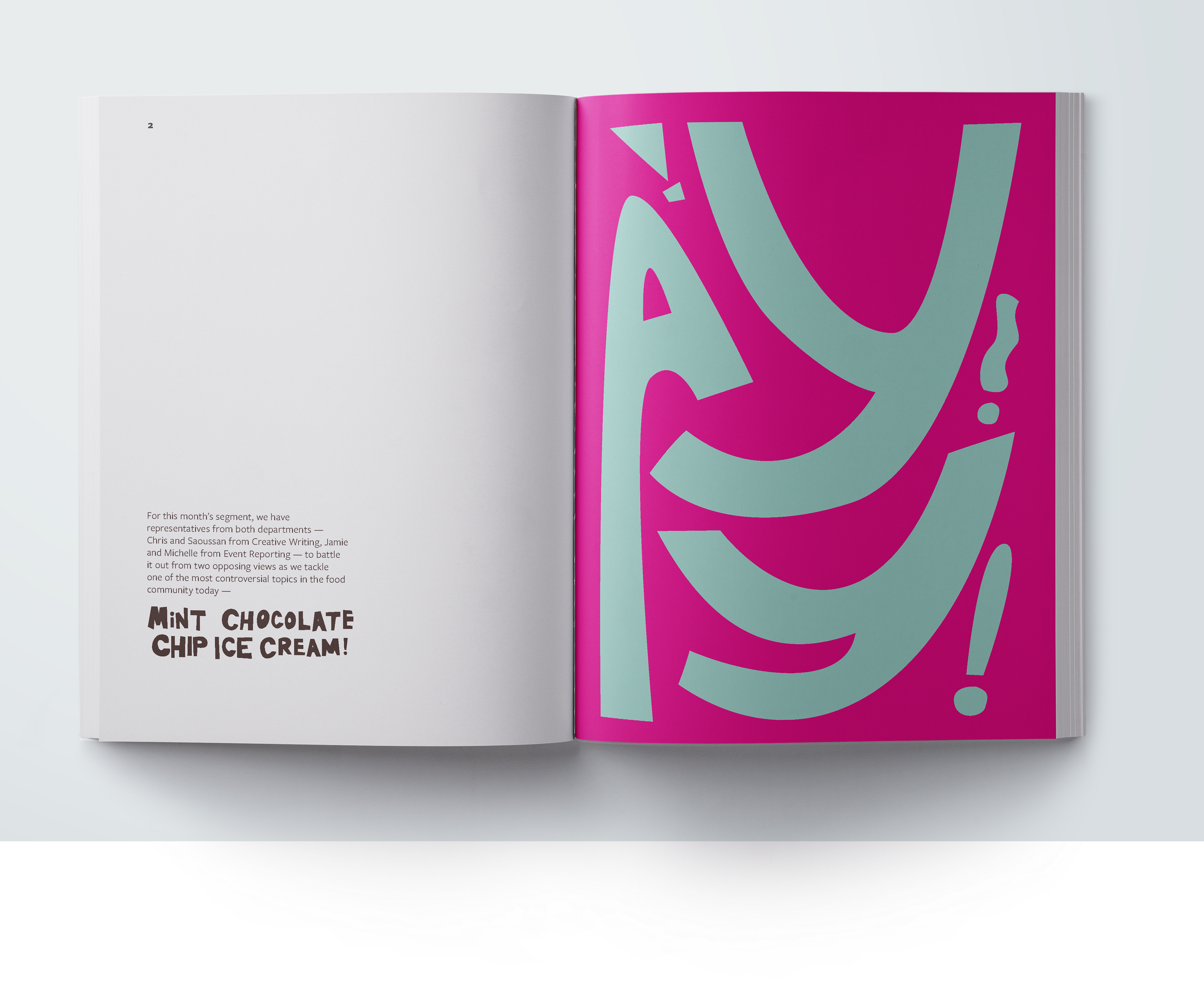
As the cumulative project for my Typography I course, I was responsible for generating all of the imagery for my book and most importantly, making intentional typographic decisions. I paid specific attention to use of the grid, creating a sequence of dynamic and varied compositions, exploration of varied page layouts, use of text to communicate a clear hierarchy of information, and mastery of scale shifts.
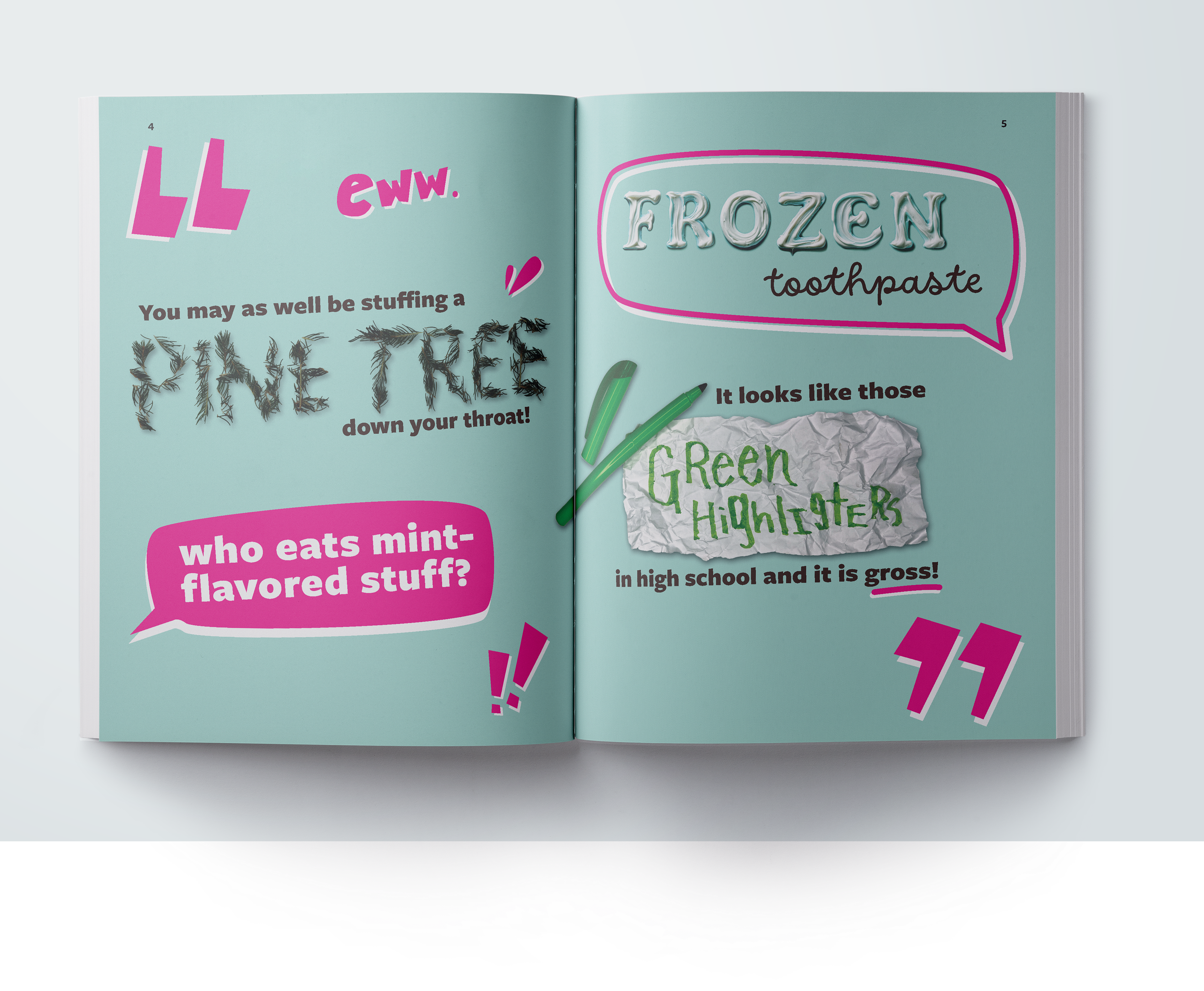
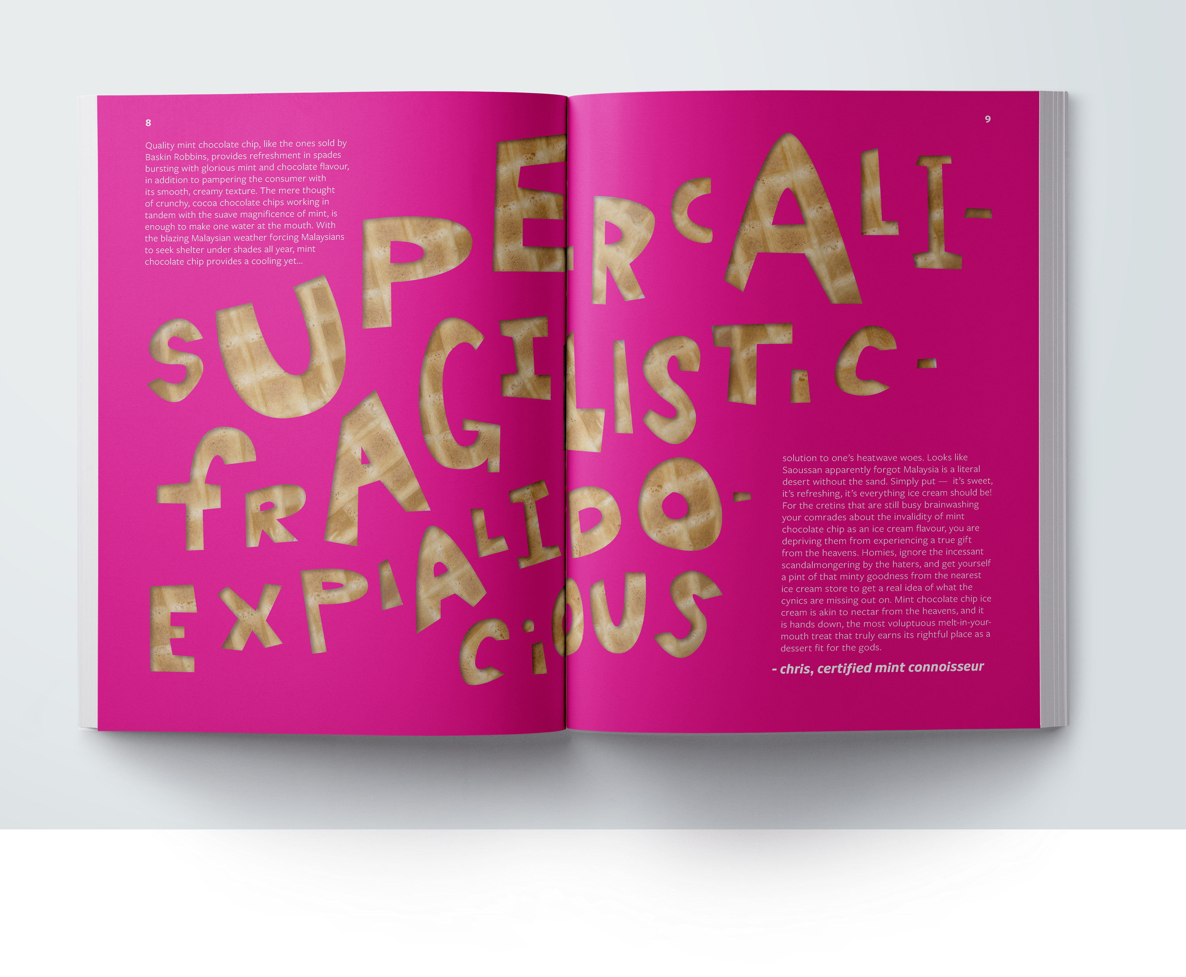
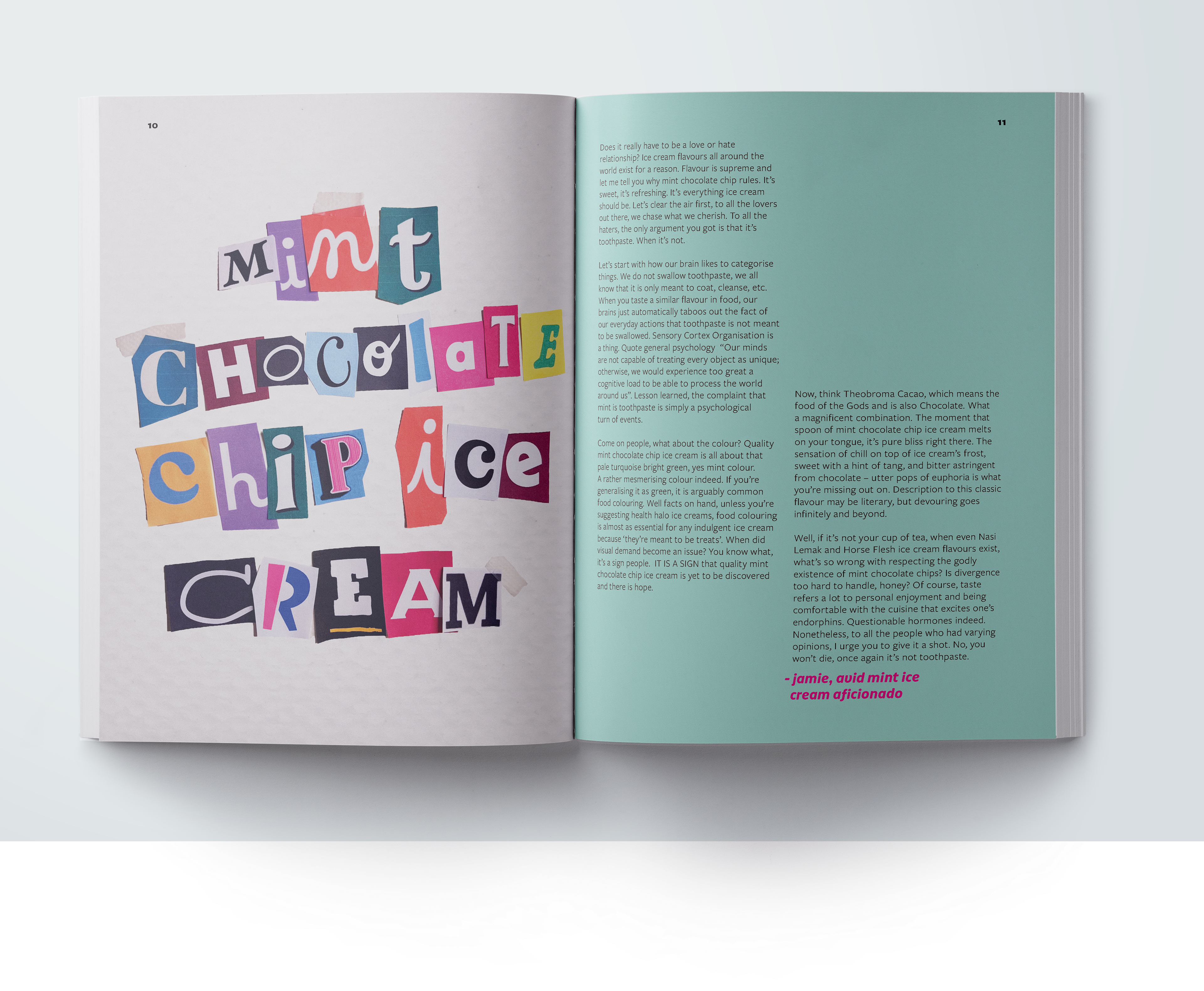
A large component of this project was the requirement for 6 instances of type as image of my own creation. Throughout my spreads, I combine a handmade typeface with generated type and other forms of expressive typography; type made out of found objects, scanned and digitally manipulated type, photographs, and collages. Use of text and type as image helped me to create a visual narrative that built onto the use of bright colors and imagery.
Yay or Nay: Mint Chocolate Chip Ice Cream, published on Sunway Echo Media (link)
Designed using fonts Puffin Display Soft by Pieter van Rosmalen and FreightSans Pro by Joshua Darden
Designed using fonts Puffin Display Soft by Pieter van Rosmalen and FreightSans Pro by Joshua Darden