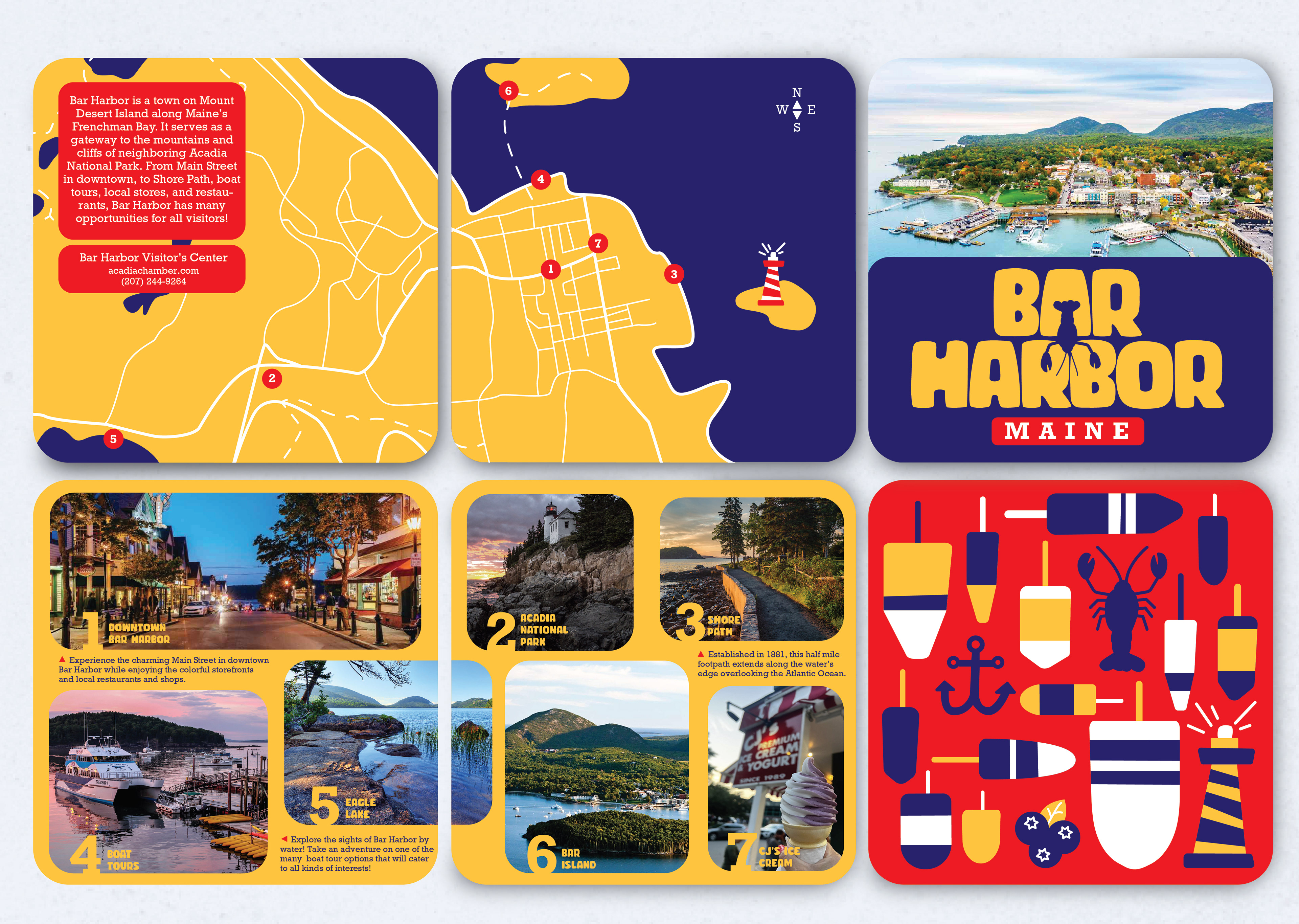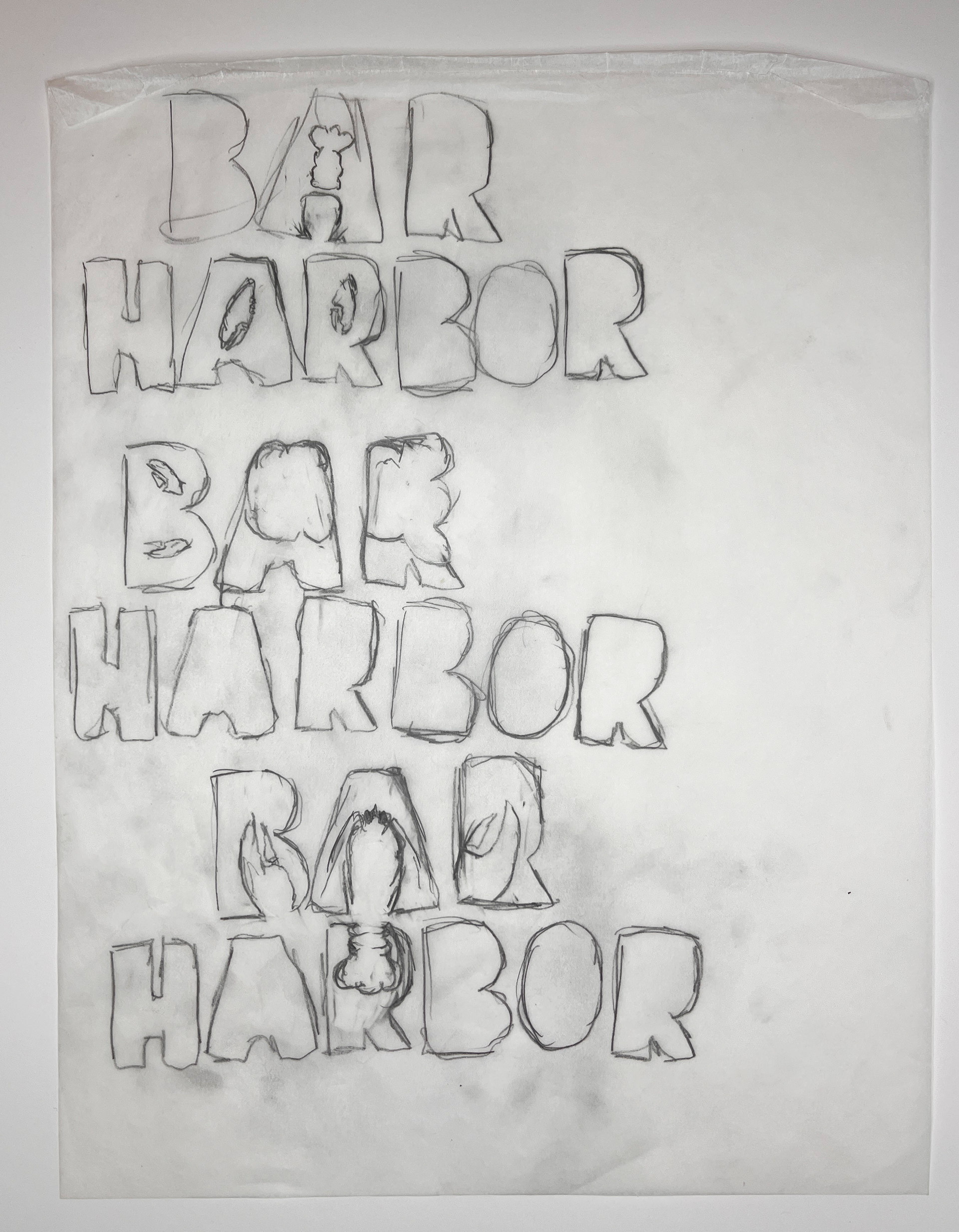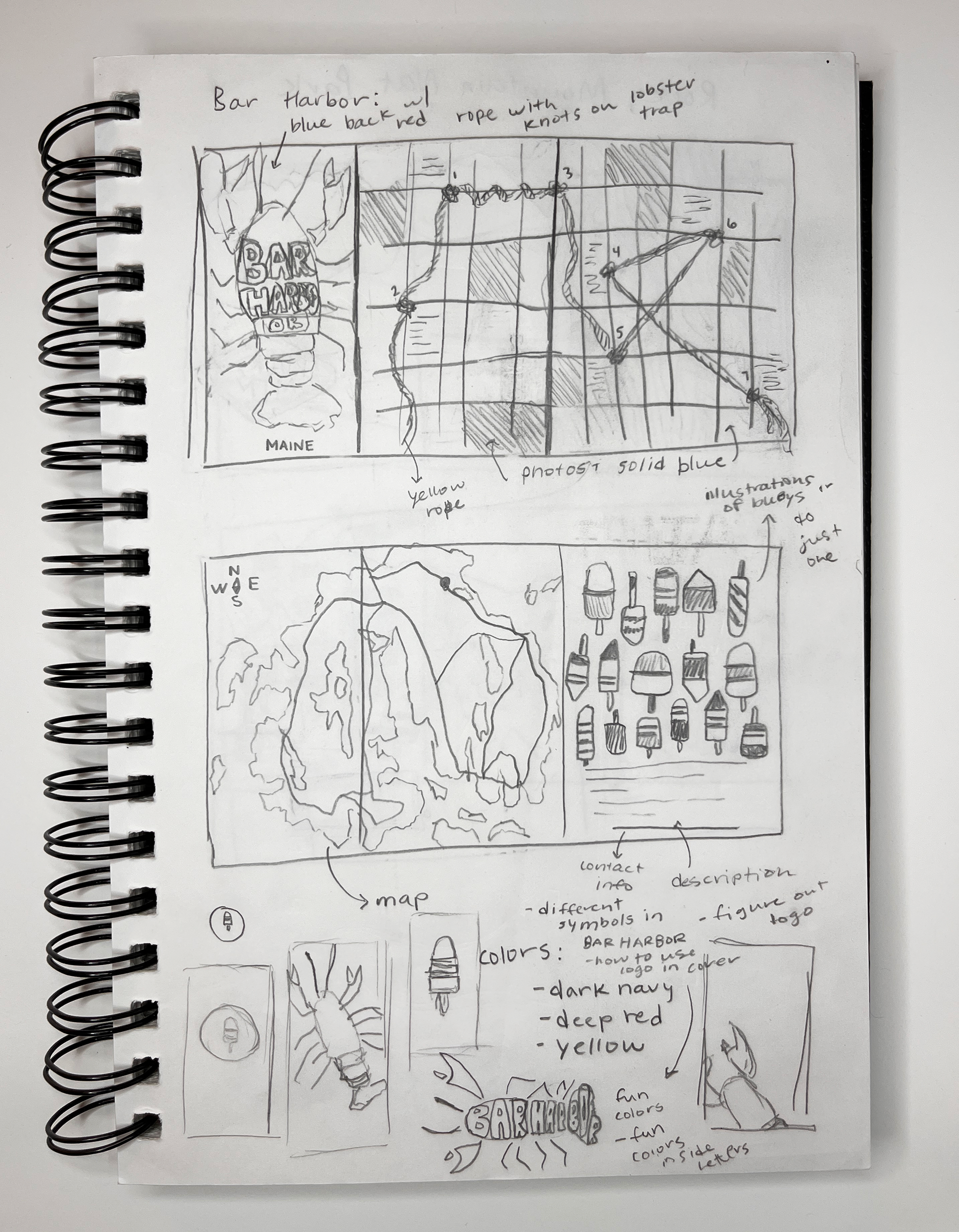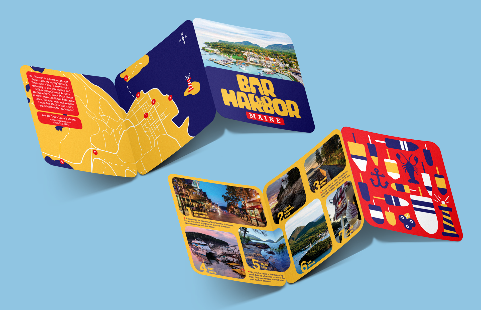
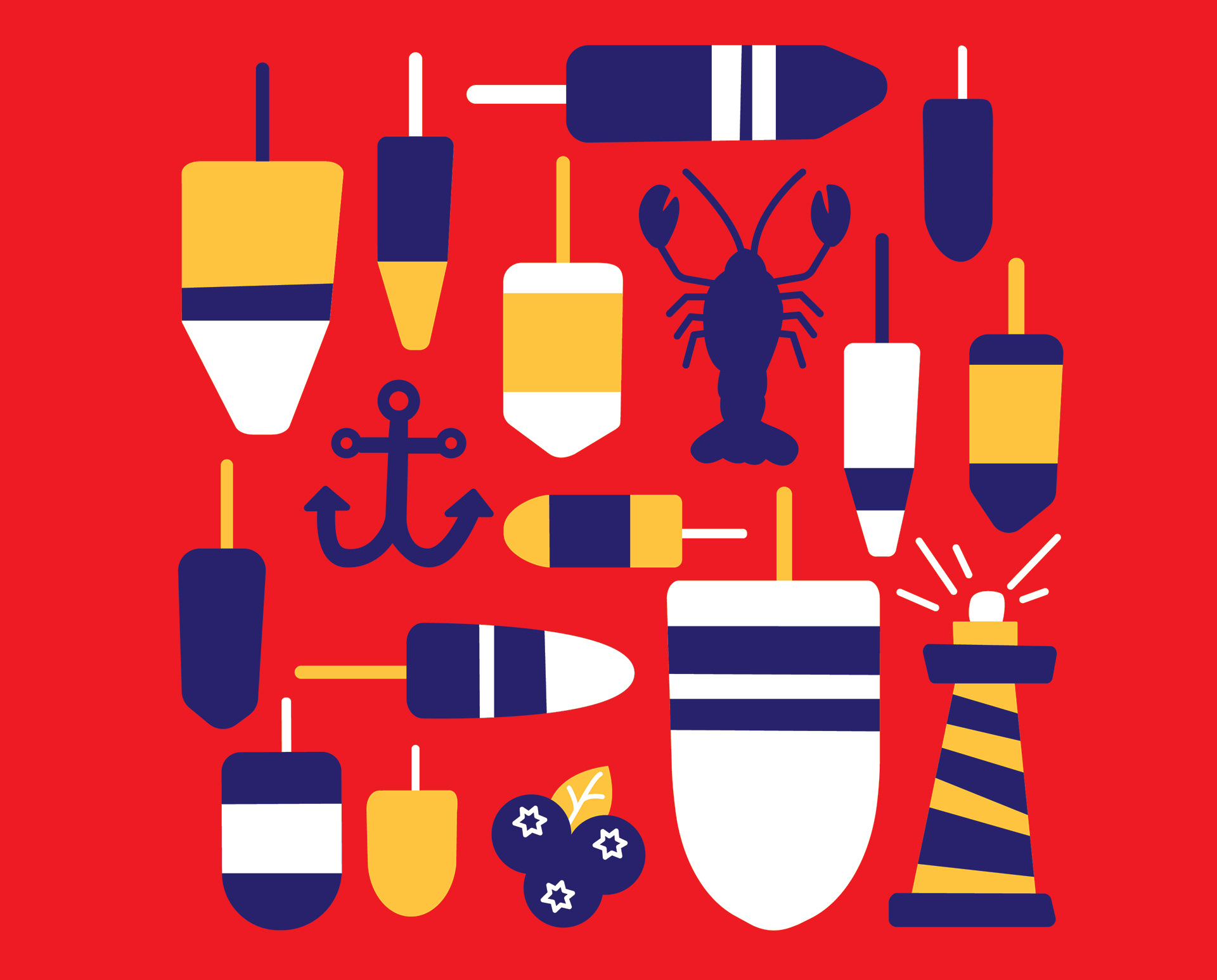
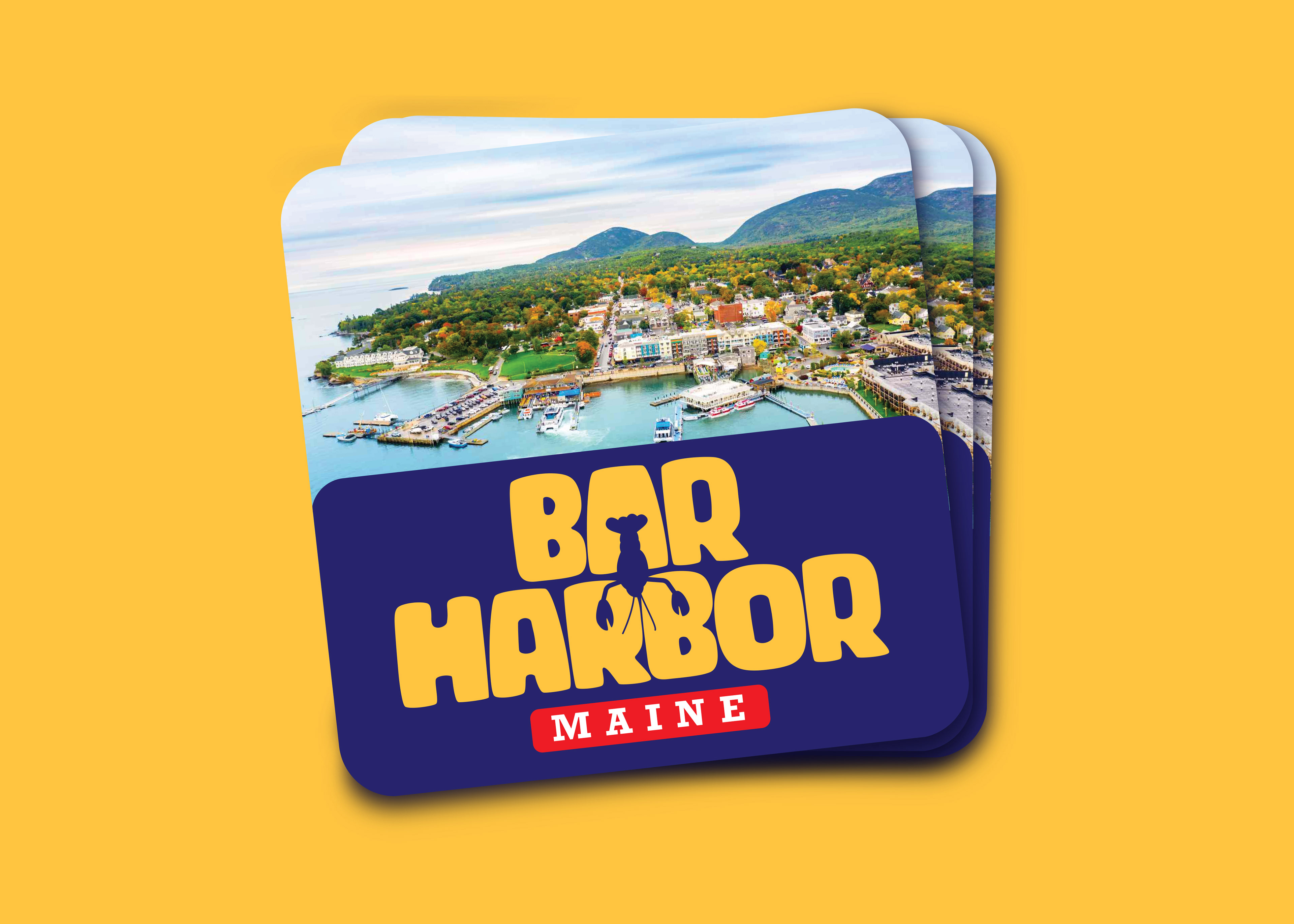
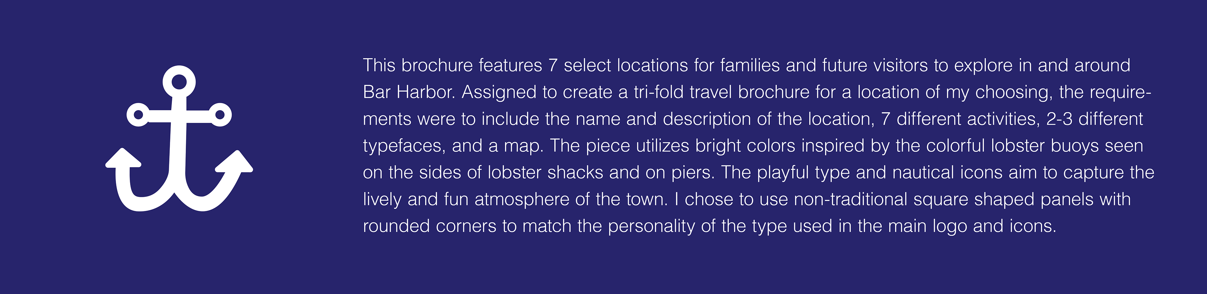
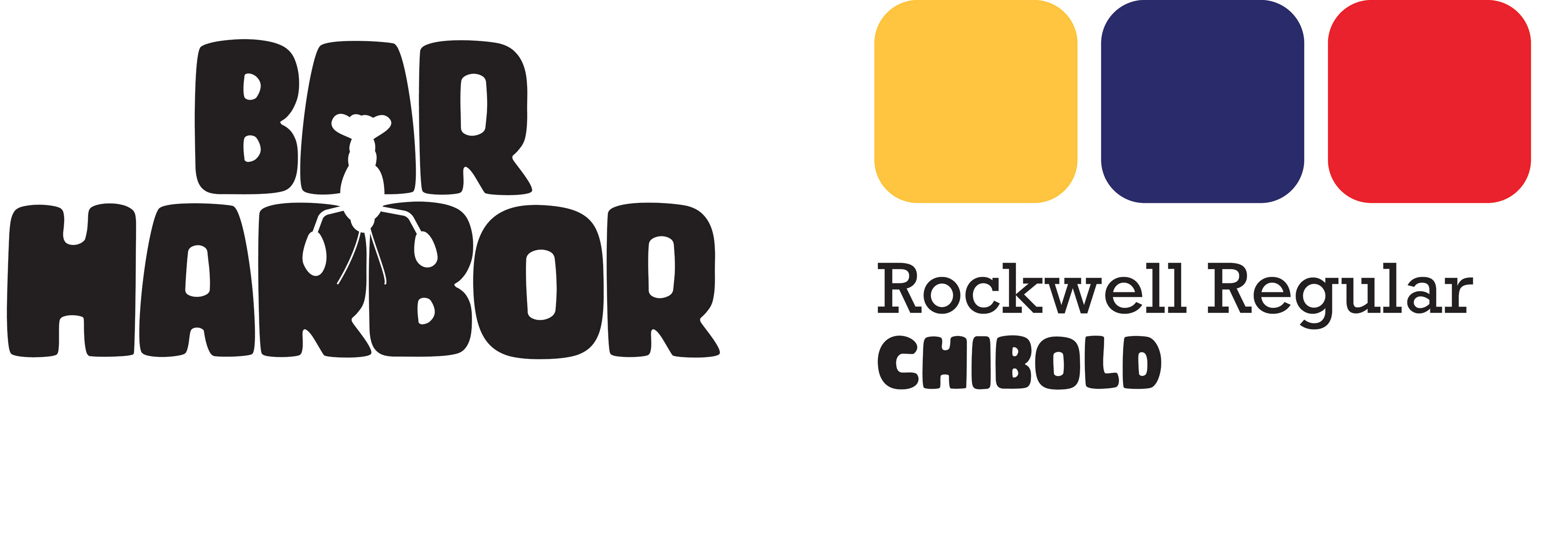
My goal with the logo design was to convey the lively and playful feeling of both the town, and the rest of the brochure design. After many iterations, and much experimentation, I landed on utilizing the lobster icon nested in the words 'Bar Harbor' to form the shapes of the letters. The logo acts as a continuation of the smooth edges and nautical symbols throughout the entire tri-fold.